 Ink Friendly
Halloween · Generator
Pumpkin stencil maker
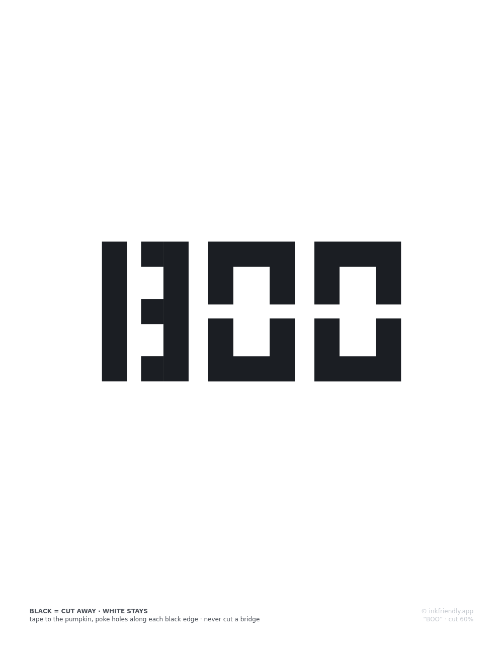
Type a name, a word or a house number and print it as a carving stencil: BOO, the family name over the door, anything up to a sheetful. The letters are set in a stencil-safe alphabet built from geometric segments with bridge gaps, so the middle of every A, B and O stays attached to the pumpkin when you carve. Nothing you type leaves your device.
Adjust
Details
How this stencil maker works
An ordinary typeface falls apart the moment you carve it. The counters (the enclosed holes in A, B, D, O, P, Q, R and several digits) become islands of pumpkin with nothing holding them, and they fall inside. So this page uses no font at all. Each letter is drawn in code as rectangles and simple polygons on a grid 100 units tall, with 18-unit strokes and 10-unit gaps, called bridges, wherever a counter would otherwise be sealed off, so each bridge is a tenth of the letter height. Bowls detach from stems in B, D, P and R, rings break at the sides in O, Q, 0 and 8, and the A keeps its apex open. The site's tests flood-fill every letter's actual geometry, with the cut edges thickened the way a real saw cut is, and the build fails if any region of pumpkin would be left unreachable.
Choose Large, Medium or Small for letters 60, 42 or 28 mm tall, and words wrap line by line at that size. Then pick US Letter or A4, portrait or landscape, and a margin between 5 and 25 mm. When the text needs more room, all the letters shrink by the same amount, so no letter is squeezed on its own and the proportions hold. The readout shows how many letters were set and the height they came out at, and the maker puts everything on a single sheet. The sheet is an SVG in real millimeters, printed through your browser's dialog. The stamp at the foot carries the transfer method and the cut-area figure: the share of the lettering block that gets cut away, which the page works out by sampling the letter shapes. The lettering is centered between the margins, in the space above the stamp. The same text at the same settings produces the identical sheet every time, because nothing on the page is random. The sheet also works as a printable letter stencil for anything else you would cut or paint through, since the bridges keep it in one piece whatever is behind the paper.
Letters below about 20 mm carve poorly with a kitchen saw, whatever the paper says; the 6 mm minimum size is there for tracing with a marker. Set the print dialog to 100% or "Actual size". "Fit to page" shrinks the whole sheet, bridges included, and the bridges are the one part of a stencil you cannot afford to lose.